Interactive Custom Sheet
Introduction
In this post, I will show you how to build the above layout, but the main focus will be the interactive sheet. So I will divide this article into 2 sections, the first section will be the normal layout, and the second will be the interactive sheet and Custom ToolBar.
Requirements
- Xcode 12 or greater
- MacOS Catalina or greater
- Swift 5.0 or greater
- iOS 14 or greater
Get started
- Open Xcode
- Create a new Xcode project
- Select single view app and click next
- Name your app and make sure the user interface is Swift UI
- Last, click Finish.
Rename the ContentView file and the struct to WikiApp and make sure you rename its reference in SceneDelegate
  func scene(_ scene: UIScene, willConnectTo session: UISceneSession, options connectionOptions: UIScene.ConnectionOptions) {
        // Use this method to optionally configure and attach the UIWindow `window` to the provided UIWindowScene `scene`.
        // If using a storyboard, the `window` property will automatically be initialized and attached to the scene.
        // This delegate does not imply the connecting scene or session are new (see `application:configurationForConnectingSceneSession` instead).

        // Create the SwiftUI view that provides the window contents.
        let wikiApp = WikiApp()

        // Use a UIHostingController as window root view controller.
        if let windowScene = scene as? UIWindowScene {
            let window = UIWindow(windowScene: windowScene)
            window.rootViewController = ::UIHostingController(rootView: weatherApp)::
            self.window = window
            window.makeKeyAndVisible()
        }
    }
Wiki Card
Now, create a new group (Folder) and inside it create a swiftUI file named WikiCard
Replace the body content with this:
 var icon = "book.fill"
    var color = "orange"
    var text = "All Wikis"

    var body: some View {
         HStack {
            VStack(alignment: .leading, spacing: 15 ){
                Image(systemName: icon).foregroundColor(Color.white)
                Text(text).foregroundColor(Color.white)
            }

            Spacer()
            Image(systemName: icon).resizable()
                .foregroundColor(Color.white.opacity(0.3))
                .frame(width: 40, height: 40)
                .aspectRatio(contentMode: .fit)

        }.padding()
            .frame(minWidth: 0.0, maxWidth: .infinity, alignment: .leading)
            .background(Color(color))
            .cornerRadius(15)
            .shadow(color: Color(color)
            .opacity(0.4), radius: 10, x: 0, y: 5)

       }

    }
And the preview should show this:

If you didn’t copy the colours and images folders from the completed project, you might not see that. Feel free to use whatever colours you want
The code is pretty self-explanatory, I have just put the book icon and the ‘All Wikis’ text into a VStack which I align Horizontally with the big book icon pushed to extreme right edge with Spacer()
ViewModifiers
Next, create a new folder named Modifiers and inside it add a new swift file named NavIconStyle. Put the following code in it:
struct NavIconStyle: ViewModifier {
    func body(content: Content) -> some View {
        content.frame(width: 20, height: 20).foregroundColor(Color.black)
    }
}
A ViewModifier is a modifier that you apply to a view or another view modifier, producing a new modified version of the original value.
Defining that viewModifier will help us reuse the same code in more than one place. You will see how to use it shortly.
Wiki App
Now, Replace the Text(“Hello World”) in WikiApp body with the following:
 NavigationView {
            ScrollView(showsIndicators: false) {
                VStack(spacing: 20){
                    HStack(spacing: 20){
                        WikiCard()
                        WikiCard(icon: "lock.fill", color: "blue", text: "Private")
                    }

                    HStack(spacing: 20){
                        WikiCard(icon: "bookmark.fill", color: "purple", text: "Bookmarked")
                        WikiCard(icon: "macwindow", color: "green", text: "Templates")
                    }

                }
            }.padding(.horizontal)
                .padding(.bottom, 30)
                .navigationBarTitle("Wiki Lists")
                .navigationBarItems(leading: Button(action: {
                }) {
                    Image(systemName: "chart.bar").resizable().modifier(NavIconStyle())
                    }, trailing: Button(action: {

                    }){
                        Image(systemName: "chart.pie").resizable().modifier(NavIconStyle())
                })
        }
In the code above, I’ve created a 2 by 2 wikiCard grid by putting 2 HStacks containing 2 WikiCard each inside a VStack; then I surround the entire thing with ScrollView, and last I surround the ScrollView with a NavigationView to create a navigationBar. Notice where I put the navigationBar modifiers. I didn’t add modifiers to the NavigationView itself; I’ve added to its child which is the ScrollView. Now, look how I use the modifer on the Navigation Button images, as you can see I reuse the NavIconStyle() on both buttons.
That’s it for this section… The rest will be very simple to implement and you can add whatever you want. I just don’t want to make this article too long with unnecessary content. If you want to know how I did the rest of this screen, just download the completed project and take a look, the code is pretty simple and straight forward . Let’s implement the interactive sheet now.
Interactive Sheet.
We will need to create a custom view and it will be like the built-in views, this way, we can reuse it wherever we want and be able to add child views to it as well.
Now, create a new swiftUI file inside the views folder and name it SheetView.
Change the struct to be generic in order to be able to add child views to it, you will see how shortly. Change the struct signature to this:
struct SheetView<Content>: View where Content: View {

    var body: some View {
        Text("Hello World!")
    }
}
As you can see, we made the SheetView generic where the generic parameter must be a View. After making that change, you will an error, but don’t worry we will fix that shortly.
Add the following properties inside SheetView above body:
@Binding var currentHeight: CGFloat
@Binding var movingOffset: CGFloat
var position = Position.up
var smallHeight: CGFloat = 50
var onDragEnd: ((_ position: Position)->()) = {_ in }
var content: () -> Content
Then add this simple enum just above SheetView:
enum Position {
    case up
    case down
}
Let me give you a run-down of what those properties mean.
currentHeightwill keep track of the current height after the drag has endedmovingOffsetwill keep track of the drag state, it will change and update the verticalOffsetof the view.positionwill have 2 values based on the position of the viewonDragEndwill be called when the drag has ended.contentis a closure that will return a View. Replace theText(“Hello World”)in body with:
Group(content: self.content)
And Replace SheetView call in SheetView_Previews with the following:
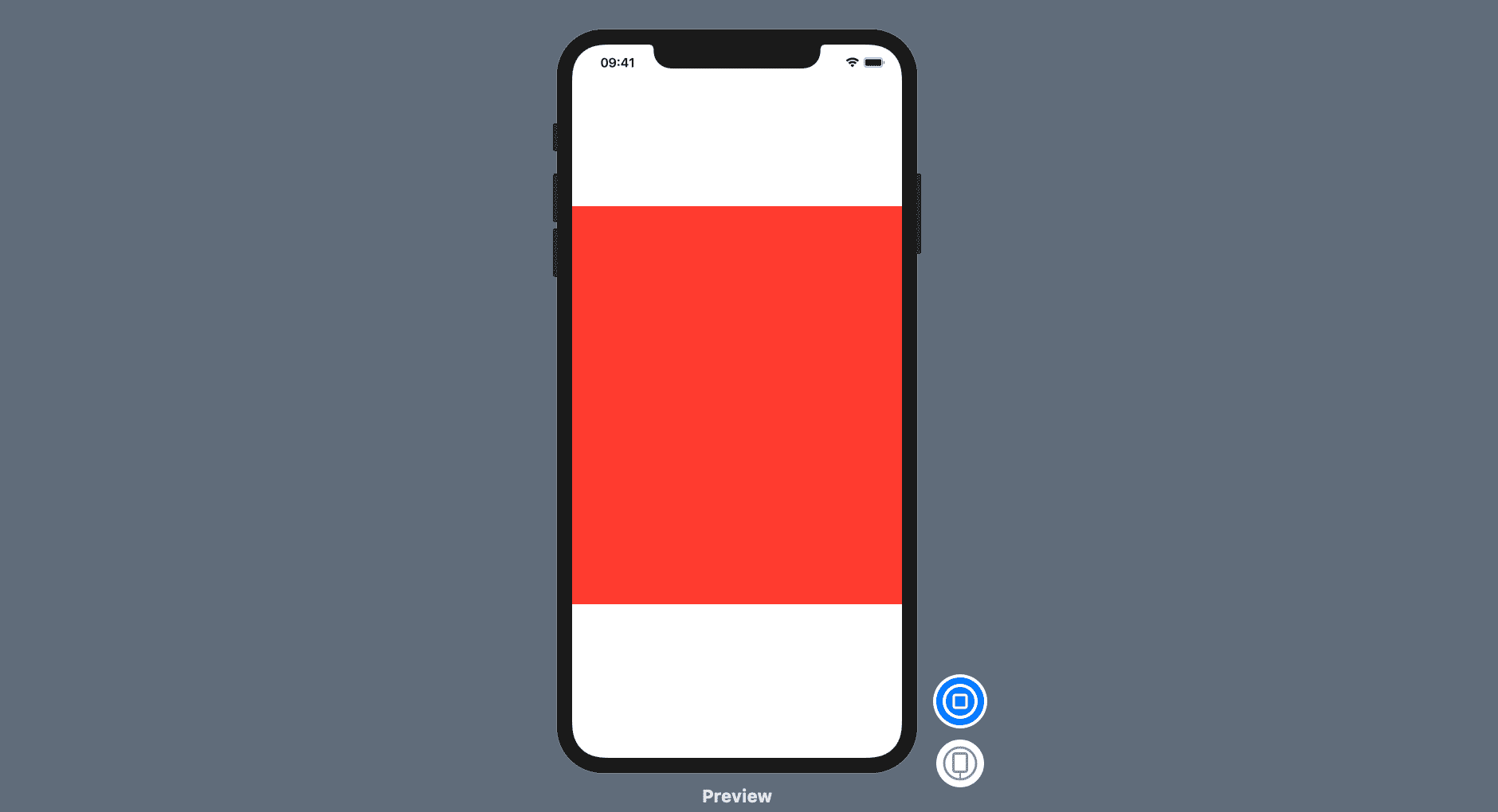
SheetView(currentHeight: .constant(0.0), movingOffset: .constant(0.0)) {
            Rectangle().foregroundColor(Color.red).frame(height: 500)
        }
I have set both the movingOffset and the currentHeight to 0.0 and give the child view a red colour and make it 500px high.
Preview:
Now, add these modifiers to the Group container:
.frame(minHeight: 0.0, maxHeight: .infinity, alignment: .bottom)
                .offset(y: self.movingOffset)
                .gesture(
                DragGesture().onChanged({ drag in
                    if self.movingOffset >= 0{
                        self.movingOffset =  drag.translation.height  + self.currentHeight
                    }
                }).onEnded({ drag in
                    withAnimation( .spring(dampingFraction: 0.7) ) {
                        if  self.movingOffset > -50 {
                            self.movingOffset = 0.0
                            self.onDragEnded(.up)
                        }

                        if drag.translation.height > 80 {
                            self.movingOffset =  self.smallHeight
                            self.onDragEnded(.down)
                        }
                        self.currentHeight = self.movingOffset
                    }
                })
        )
Explanation:
.frame(minHeight: 0.0, maxHeight: .infinity, alignment: .bottom): makes the parent View which is the group container fill the entire screen vertically and makes all children aligned to the bottom. Try removing the alignment value and you will see how it’s affecting the red rectangle inside..offset(y: self.movingOffset): I set the Y offset to the moving offset so that when we start dragging; the view will move by changing it’s Y offset..gesture(…): This is where the magic happens. InonChanged, we check if themovingOffsetvalue is greater that or equal to 0 and perform the drag otherwise we don’t want to move the view up. I add thecurrentHeightvalue to themovingOffsetto adjust the initial position of the View. Try removing thecurrentHeightyou will see that the view is always jumping to the initial position. InonEnded: Notice how I put the logic inside awithAnimationblock, this is because I want the view to animate back to the final height based on where the user lifted her or his finger..edgesIgnoringSafeArea(.all): remove the bottom gap and makes the view fill the entire bottom and top area. It’s now time to add our Custom View to the main screen to test the drag.
Create a new SwiftUI file inside Views and named CustomSheetView. Add these properties to the top of the file:
@Binding  var currentHeight: CGFloat
@Binding var movingOffset: CGFloat
And replace the content inside body with this:
 SheetView(currentHeight: self.$currentHeight, movingOffset: self.$movingOffset, smallHeight: 300, onDragEnd: { position in
            // Do things on drag End
        }) {
            ZStack(alignment: .top) {
               Text("We add views later")
            }
            .background(Color.white)
            .shadow(color: Color.gray.opacity(0.2), radius: 6, x: 0.0, y: -5)
        }
Preview:

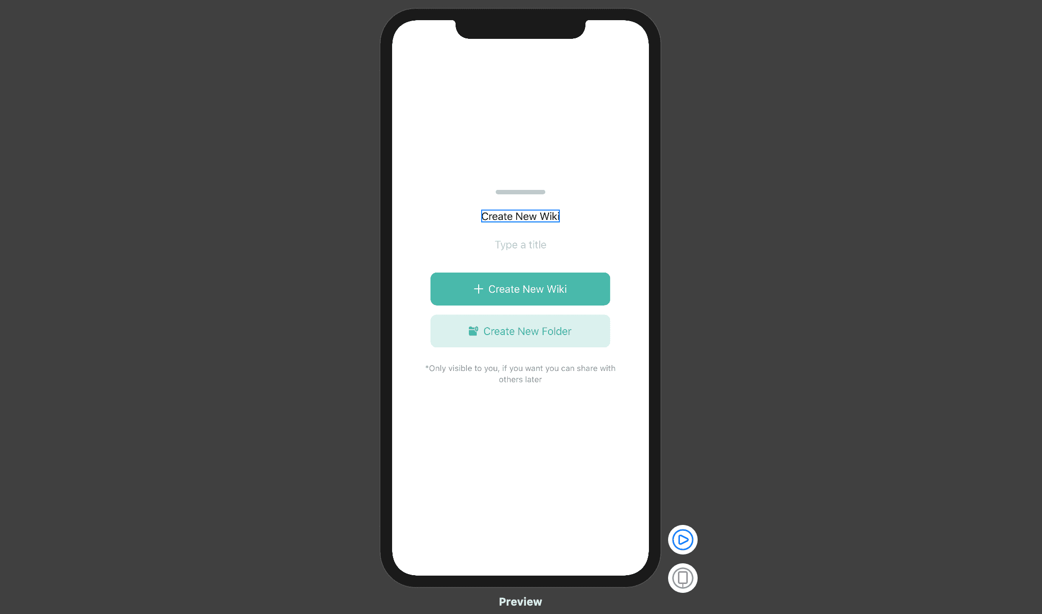
Let’s now create the view that will replace that text. In Views folder, create a new SwiftUI file named CreateNewWikiView and replace the entire content with this:
Create New Wiki View
import SwiftUI

struct CreateNewWikiView: View {

    @Binding var movingOffset: CGFloat
    let screenSize = UIScreen.main.bounds.size
    @State private var textTitle = ""

    var body: some View {
        let screenWidth = screenSize.width
        let phoneRatio = String(format: "%.3f", screenSize.width / screenSize.height)
        let refRatio =   String(format: "%.3f",  9.0 / 16.0)
        let isXorAbove = phoneRatio != refRatio

        return VStack(spacing: 25) {
            //                    Spacer()
            Rectangle()
                .frame(width: 80, height: 7)
                .cornerRadius(5)
                .foregroundColor(Color.gray.opacity(0.5))
            Text("Create New Wiki")

            VStack {
                TextField("Type a title", text: self.$textTitle, onEditingChanged: { value in
                    print(value)
                }, onCommit: {
                    print("Finished editing")
                }).multilineTextAlignment(.center)
                Divider().padding(.horizontal,50)
            }

            VStack(spacing: 15){
                WikiButton(icon: "plus", color: "green", text: "Create New Wiki", isFolder: false, action: {
                    print("Adding new wiki")
                })
                WikiButton(icon: "folder.fill.badge.plus", color: "green", text: "Create New Folder", isFolder: true,action: {
                    print("Adding new folder")
                })
            }

            Text("*Only visible to you, if you want you can share with others later")
                .font(.footnote)
                .multilineTextAlignment(.center)
                .lineLimit(2)
                .frame(width: screenWidth * 0.8 )
                .foregroundColor(Color.gray)

        }.padding(.bottom, isXorAbove ? 60 : 50 )
            .padding(.top, 15)
    }
}

struct CreateNewWikiView_Previews: PreviewProvider {
    static var previews: some View {
        CreateNewWikiView(movingOffset: .constant(0.0))
    }
}
Wiki Button
Create another swiftUI file named WikiButton and replace everything inside with this:
import SwiftUI

struct WikiButton: View {

    let screenSize = UIScreen.main.bounds.size
    var icon = "plus"
    var color = "green"
    var text = "Create New Wiki"
    var isFolder = false
    var action: (()->()) = {}

    var body: some View {
        let screenWidth = screenSize.width

        return Button(action: {
            self.action()
        }) {
            HStack {
                Image(systemName: icon)
                    .resizable()
                    .frame(width: 15, height: 15)
                    .foregroundColor(isFolder ? Color(color) : Color.white)

                Text(text)
                    .foregroundColor(isFolder ? Color(color) : Color.white)

            }.frame(width: screenWidth * 0.7 )
                .padding(.vertical)
                .background(Color(color).opacity(isFolder ? 0.2 : 1))
                .cornerRadius(10)
        }
    }
}

struct WikiButton_Previews: PreviewProvider {
    static var previews: some View {
        WikiButton()
    }
}
The above code just create a button and styles it properly. Refresh the preview by clicking the resume button. Preview:
No need to explain this because the code is clear and self-explanatory. Just take a minute or two to read and understand what’s going on.
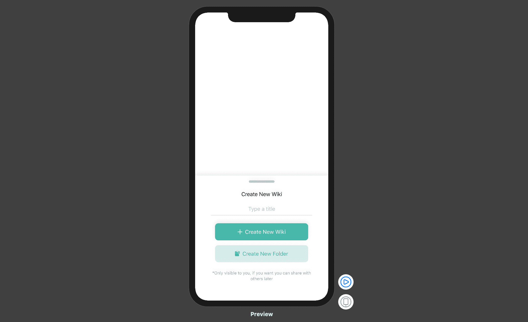
Now, in CustomSheetView, replace the Text(…) with this:
CreateNewWikiView(movingOffset: self.$currentHeight)
Preview:
Let’s now integrate our CustomSheetView on the main screen. Add these 2 properties inside WikiApp above body:
@State private var currentHeight: CGFloat = 0.0
@State private var movingOffset: CGFloat = 0.0
Surround the NavigationView with a ZStack container and add this inside it below the NavigationView:
CustomSheetView(currentHeight: self.$currentHeight, movingOffset: self.$movingOffset)
You will now be able to drag the view up and down like this:
ToolbarView
The step will be focused on adding some more awesomeness. Add a new SwiftUI file named ToolbarButton inside the Views folder and replace everything with the following:
import SwiftUI

struct ToolbarButton: View{

    var icon = "bubble.left"
    var isSelected = false
    var isPlus = false
    var action: (()->()) = {}


    var body: some View{
        let selectedColor = "orange"

        return Button(action: {
            self.action()
        }) {
            HStack {
                Image(systemName: self.icon)
                    .resizable()
                    .aspectRatio(1, contentMode: .fit)
                    .frame(width: 30, height: 30)
                    .foregroundColor( isPlus ? Color.white : isSelected ? Color(selectedColor) : Color.gray)

            }.padding(10)
                .background(isPlus ? Color("green") : isSelected ? Color(selectedColor).opacity(0.2) : Color.gray.opacity(0.2))
                .cornerRadius(10)
        }
    }
}


struct ToolbarButton_Previews: PreviewProvider {
    static var previews: some View {
        ToolbarButton()
    }
}
This code just creates and styles a simple button that will be reused to create a ToolbarView:

Then create a new SwiftUI file named ToolbarView and replace everything inside with the following:
import SwiftUI

struct ToolBarView: View {
    @Binding  var currentHeight: CGFloat
    @Binding var movingOffset: CGFloat

    var body: some View {
        HStack{
            ToolbarButton(icon: "triangle", isSelected: true) {}
            Spacer()
            ToolbarButton(icon: "plus", isPlus: true) {
                withAnimation(.spring(dampingFraction: 0.7)) {
                    self.currentHeight = 0.0
                    self.movingOffset = 0.0
                }
            }
            .shadow(color: Color("green").opacity(0.5), radius: 5, x: 0.0, y: 10)
            Spacer()
            ToolbarButton( icon: "bubble.left", isSelected: false) {}
        }.padding(.top, 15)
            .padding(.horizontal, 30)
            .frame(minWidth: 0.0, maxWidth: .infinity)
    }
}


struct ToolBarView_Previews: PreviewProvider {
    static var previews: some View {
        ToolBarView(currentHeight: .constant(0.0), movingOffset: .constant(0.0))
    }
}
This code creates a Horizontal stack of ToolbarButtons.
Preview

Then, in CustomSheetView , add this below the CreateNewWikiView call:
ToolBarView(currentHeight: self.$currentHeight, movingOffset: self.$movingOffset)
Let’s now fix everything up. In CreateNewWikiView, add this modifier to the outer VStack after the second padding modifier:
.offset(y: movingOffset )
And in ToolBarView, add this modifier to the outer HStack after frame(…):
.offset(y: self.currentHeight == 0 ? -100 : 0)
Those 2 modifiers will not make the design as we want it but it’s a step in the right direction. The last thing is to add the 2 rounded top corners:
Create a new folder named Shapes and inside it create a swiftUI file named RoundedShape and replace everything inside with the following:
struct RoundedShape: Shape {
    func path(in rect: CGRect) -> Path {
        let cornerRadius:CGFloat = 40
        var path = Path()

        path.move(to:  CGPoint(x: 0, y: cornerRadius))
        path.addQuadCurve(to: CGPoint(x: cornerRadius, y: 0), control: CGPoint.zero)
        path.addLine(to: CGPoint(x: rect.width - cornerRadius, y: 0))
        path.addQuadCurve(to: CGPoint(x: rect.width, y: cornerRadius), control: CGPoint(x: rect.width , y: 0))
        path.addLine(to: CGPoint(x: rect.width, y: rect.height))
        path.addLine(to: CGPoint(x: 0, y: rect.height))
        path.closeSubpath()

        return path
    }
}
The code create a shape that we will use to clip the CustomSheetView’s ZStack container.
Add this modifier to the ZStack inside the CustomSheetView after the background .
.clipShape(RoundedShape())
The good thing is that we’ve just killed 2 birds with 1 stone. We’ve added the top rounded corners to the view and hidden the ToolBarView hence creating the effect we wanted. Now, open the WikiApp file and resume the preview.
That’s it folks. Enjoy and subscribe for more.