Apple Watch Rings
Resources
Table of contents
Introduction
This article will be focused on working with paths. You will learn how to
- create custom shapes with paths
- add gradients colours to custom shapes
- Animate custom shapes
Requirements
- Xcode 12 or greater
- MacOS Catalina or greater
- Swift 5.0 or greater
- iOS 14 or greater
Get started
- Open Xcode
- Create a new Xcode project
- Select single view app and click next
- Name your app and make sure the user interface is Swift UI
- Last, click Finish.
With that out of the way, Let’s get going, shall we ?!
Rename the ContentView filename and the struct to RingGraph, and make sure you rename its reference in SceneDelegate
func scene(_ scene: UIScene, willConnectTo session: UISceneSession, options connectionOptions: UIScene.ConnectionOptions) {
    // Use this method to optionally configure and attach the UIWindow `window` to the provided UIWindowScene `scene`.
    // If using a storyboard, the `window` property will automatically be initialized and attached to the scene.
    // This delegate does not imply the connecting scene or session are new (see `application:configurationForConnectingSceneSession` instead).

    // Create the SwiftUI view that provides the window contents.
 :: let ringGraph = RingGraph()::

    // Use a UIHostingController as window root view controller.
    if let windowScene = scene as? UIWindowScene {
        let window = UIWindow(windowScene: windowScene)
        window.rootViewController = ::UIHostingController(rootView: weatherApp)::
        self.window = window
        window.makeKeyAndVisible()
    }
}
Change everywhere you see ContentView referenced to RingGraph.
RingShape
Create a folder named Shapes and inside it create a swift file named RingShape.
Copy the following code and paste it in:
import SwiftUI

struct RingShape: Shape {
    var percent: Double
    var radius: CGFloat = 100

    var animatableData: Double{
        get{
            return percent
        }

        set{
            percent = newValue
        }
    }


    func path(in rect: CGRect) -> Path {
        let width = rect.width
        let height = rect.height
        let center = CGPoint(x: width / 2, y: height / 2)
        let endAngle = Angle(degrees: ( percent / 100 * 360) - 90)
        let radius = width / 2

        return Path{ path in
            path.addArc(center: center, radius: radius, startAngle: Angle(degrees: -90.0) , endAngle: endAngle, clockwise: false)
        }
    }
}
Explanation
- To create a custom path, the struct need to conform to the
Shapeprotocol. - The first 2 properties are obvious. As for the third property , we need that to animate the drawing of the path. Every time you need to animate a path, make sure to override that property and return the property that will be changing the state of the path to be animated.
- When you conform to the
Shapeprotocol, you will be required to override this methodpath(in rect: CGRect) -> Path. - In the path method, I set up constants to be used to draw the arc. Notice the -90 value. I subtract that value because I want the drawing to start from 90 degrees rather than 0 (default).
RingView
Now, it’s time to create a view that will hold our newly created path.
Create a new folder named Views and inside it create a swiftUI file named RingView.
Replace the content of that file with the following code:
import SwiftUI

struct Ring: View {
    @Binding var percent: Double
    var thickness: CGFloat = 35
    var fontSize:CGFloat = 15
    var gradientColors =  [Color.blue, Color.red]

    var body: some View {
        return drawRing()
    }

    private func drawRing() -> some View{
        let formattedPercent = String(format: "%.f", CGFloat(self.percent))

        return ZStack(alignment: .top) {

            RingShape(percent: 100)
                .stroke(style: StrokeStyle(lineWidth: self.thickness - 5))
                .fill(Color.gray.opacity(0.2))

            RingShape(percent: self.percent)
                .stroke(style: StrokeStyle(lineWidth: self.thickness, lineCap: CGLineCap.round))
                .fill(
                    LinearGradient(
                        gradient: .init(colors: gradientColors), startPoint: .init(x: 0.2, y: 0.4), endPoint:  .init(x: 0.5, y: 1)
                    )
            )

            Text("\(formattedPercent)%")
                .multilineTextAlignment(.trailing)
                .font(.system(size: fontSize, weight: .black))
                .offset(y: -thickness / 4)
                .shadow(radius: 10)
        }
    }
}

struct Ring_Previews: PreviewProvider {
    static var previews: some View {
        Ring(percent: .constant(50))
    }
}
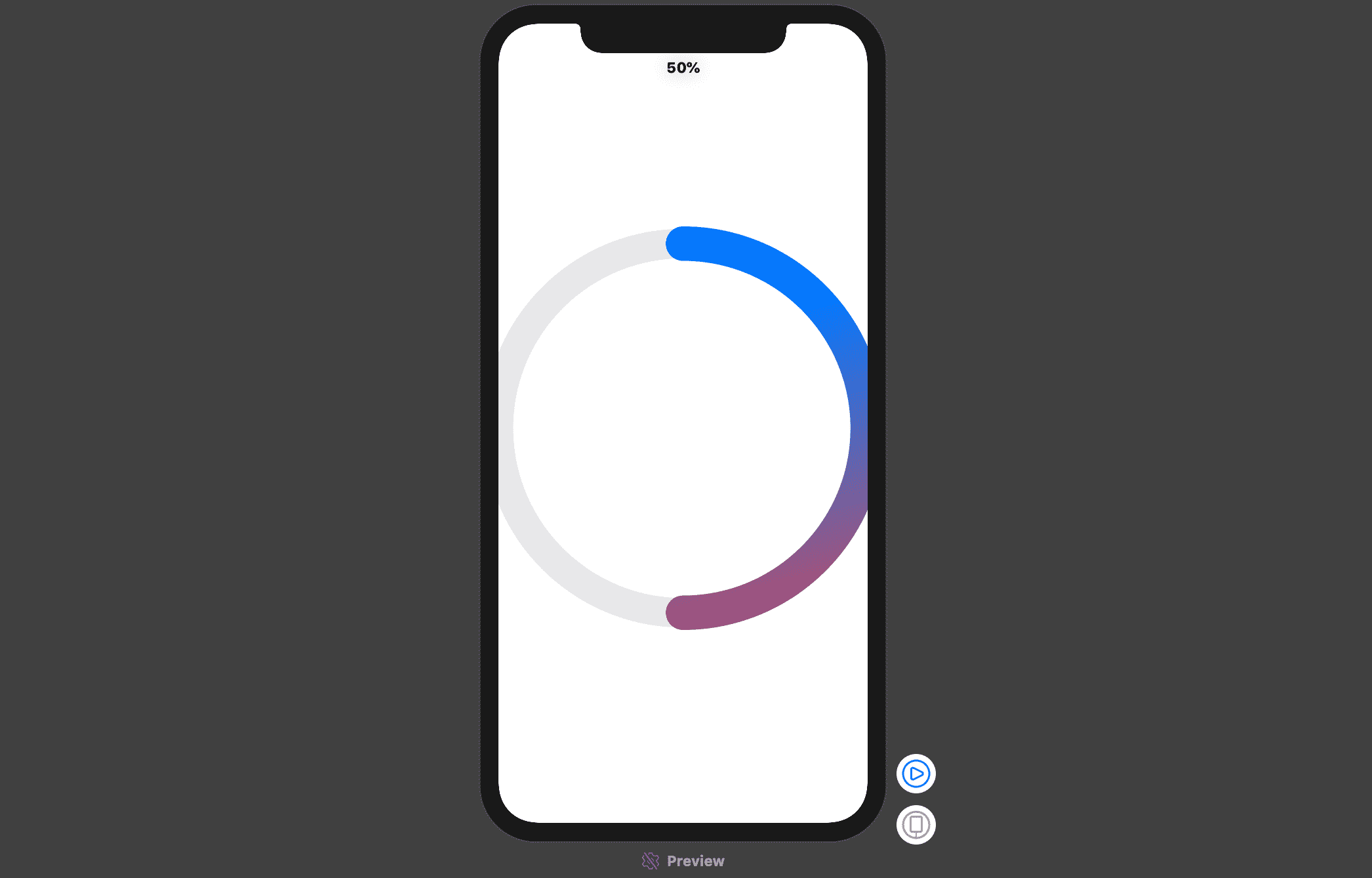
This code is also straight forward. The bit to note here is how I create 2 RingPaths; the first one is a full circle with a grey colour and the second is the one that will be indicating the percentage level. Try playing with the startPoint and endPoint to see how it works.
Preview:
Putting everything together
If you haven’t downloaded the completed project linked above, you should do it now in order to use the colours that I’ve used. Just find the Assets.xcassets folder and copy the colours folder.
Create a new folder named Utils and create a swift file in it named Colors. Add the following block of code in that file:
import SwiftUI


extension Color {
    static var ring1color1: Color {
        return Color("ring1color1")
    }
    static var ring1color2:Color {
        return Color("ring1color2")
    }
    static var ring2color1:Color {
        return Color("ring2color1")
    }
    static var ring2color2:Color {
        return Color("ring2color2")
    }
    static var ring3color1:Color {
        return Color("ring3color1")
    }
    static var ring3color2:Color {
        return Color("ring3color2")
    }
}
Then create a new folder named Modifiers and add a file named NutrientModifier containing the following block of code:
import SwiftUI

struct NutrientModifier: ViewModifier {
    var color: Color = .red
    func body(content: Content) -> some View {
           content.foregroundColor(color)
           .frame(width: 25, height: 25)
           .cornerRadius(4)
    }

}
This is just a simple modifier that we will use in a short while.
In the RingGraph file, add these at the top inside the struct:
    @State var percent1: Double = 60
    @State var percent2: Double = 70
    @State var percent3: Double = 80

    var gRing1:[Color] = [Color.ring1color1, Color.ring1color2]
    var gRing2:[Color] = [Color.ring2color1, Color.ring2color2]
    var gRing3:[Color] = [Color.ring3color1, Color.ring3color2]

    private var thickness: CGFloat = 40
In the body, remove whatever is there and put this code inside
NavigationView {
                VStack {

                    Text("You have consumed \(String(format: "%.1f", CGFloat((self.percent1 + self.percent2 + self.percent3) / 3)))% today")
                        .font(.title)
                        .fontWeight(.bold)
                        .lineLimit(2)
                        .multilineTextAlignment(.center)
                        .padding(.horizontal, 30)
                        .frame(height: 70)

                    Text("Perfectly balanced \n like everything should be.")
                        .multilineTextAlignment(.center)
                        .padding(.bottom, 30)

                     // This creates the 3 rings graphs
                    self.createGrapth().frame(minWidth: 0.0, maxWidth: .infinity)
                    Spacer()
                    HStack {
                        HStack{
                            Rectangle().modifier(NutrientModifier(color: .ring1color1) )
                            Text("Carb")

                        }
                        Spacer()
                        HStack{
                            Rectangle().modifier(NutrientModifier(color: .ring2color2) )
                            Text("Protein")

                        }
                        Spacer()
                        HStack{
                            Rectangle().modifier(NutrientModifier(color: .ring3color2) )
                            Text("Fat")
                        }
                    }

                }.padding().navigationBarTitle(Text(""), displayMode: .inline).navigationBarItems(trailing: self.trailingButton())

        }
This code is self-explanatory, you will get an error because there’s no createGraph and trailingButton functions yet. Let’s now create those:
Put this inside the RingGraph struct but below the body block:
private func createGraph() -> some View{
        let width = UIScreen.main.bounds.width - 20
        return
            ZStack {
                RingView(percent: self.$percent1, thickness: self.thickness, fontSize: 15, gradientColors: gRing1).frame(width: width - thickness, height: width - thickness )
                RingView(percent: self.$percent2, thickness:  self.thickness, fontSize: 15, gradientColors: gRing2).frame(width: width - thickness * 3, height: width - thickness * 3)
                RingView(percent: self.$percent3, thickness:  self.thickness, fontSize: 15, gradientColors: gRing3).frame(width: width - thickness * 5, height: width - thickness * 5)
            }
    }

    private func trailingButton() -> some View{
          return Button(action: {
              withAnimation(.easeInOut(duration: 1)) {
                  self.percent1 = Double.random(in: 1...100)
                  self.percent2 = Double.random(in: 1...100)
                  self.percent3 = Double.random(in: 1...100)
              }
          }) {
              Image(systemName: "arrow.clockwise")
                  .resizable()
                  .frame(width: 25, height: 30)
                  .aspectRatio(contentMode: ContentMode.fit)
          }
      }
As you can see, those are 2 separate functions. The first one creates the 3 rings and the second one. generates 3 random numbers between 1 and 100 for each of the rings.
Conclusion
That’s it folks…. The RingView can be used in any scenario you can think of. Feel free to play with the code, modify it if you want, you’ll learn better that way. Happy coding. Enjoy!!!