Weather App Design
Introduction
Normally, I would start by telling you what swift UI is and blessed blah blah blah… However , I am not going to do that. If you are here, chances are you know already what Swift UI is.So, let’s just jump right into it, shall we?
Requirements
- Xcode 12 or greater
- MacOS Catalina or greater
- Swift 5.0 or greater
- iOS 14 or greater
Get started
- Open Xcode
- Create a new Xcode project
- Select single view app and click next
- Name your app and make sure the user interface is Swift UI
- Last, click Finish. Your newly created project should have the following files:

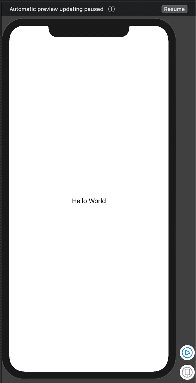
That the default project layout when you first create the project. If the simulator does not show up, click resume.
Rename the ContentView filename and struct to WeatherApp and make sure you rename its reference in SceneDelegate
func scene(_ scene: UIScene, willConnectTo session: UISceneSession, options connectionOptions: UIScene.ConnectionOptions) {
    // Use this method to optionally configure and attach the UIWindow `window` to the provided UIWindowScene `scene`.
    // If using a storyboard, the `window` property will automatically be initialized and attached to the scene.
    // This delegate does not imply the connecting scene or session are new (see `application:configurationForConnectingSceneSession` instead).

    // Create the SwiftUI view that provides the window contents.
 :: let weatherApp = WeatherApp()::

    // Use a UIHostingController as window root view controller.
    if let windowScene = scene as? UIWindowScene {
        let window = UIWindow(windowScene: windowScene)
        window.rootViewController = ::UIHostingController(rootView: weatherApp)::
        self.window = window
        window.makeKeyAndVisible()
    }
}
Change everywhere you see ContentView referenced to WeatherApp.
Every time you make a big change, the preview will disappear, just click resume to make it appear again.
I will create the UI step by step, that will be easier to understand and for to explain. Here is how to I am going to do that:
Custom Navigation Bar
Replace Text(“”Hello World) inside body with NavBarView(country: "Bahamas”), then create a new View named NavBarView outside the WeatherApp struct block above ContentView_Previews block. The NavBarView should look like this:
struct NavBarView: View {

    var country = "France"

    var body: some View{
        HStack {
            Image(systemName: "ellipsis.circle.fill")
                .resizable()
                .frame(width: 25, height: 25)
            Spacer()
            Text(country).font(.title)
            Spacer()
            Image(systemName: "magnifyingglass")
                .resizable()
                .frame(width: 25, height: 25)

        }.padding()
    }
}
Explanation:
I create an image with system icons which you can find by downloading the SF Symbol from apple developer website. I set the resizable() modifier in order to give the images a different frame which I set right after resible().
I put the title Text between 2 Spacer views to make it centered horizontally.
I add a padding on all side of the HStackView which is the container that lays out the 5 views horizontally.
Add the following below the NavBarView call in WeatherApp
  Picker("", selection: $selected){
           Text("Today").tag(0)
           Text("Tomorrow").tag(1)
       }.pickerStyle(SegmentedPickerStyle() )
           .padding(.horizontal)
You will get an errors. To fix them, surround everything with a VStack block and add this @State private var selected = 0 above body
Your WeatherApp struct should now look like this:
struct WeatherApp: View {
     @State private var selected = 0

    var body: some View {

        VStack {
            NavBarView(country: "Bahamas")

            Picker("", selection: $selected){
                     Text("Today").tag(0)
                     Text("Tomorrow").tag(1)
                 }.pickerStyle(SegmentedPickerStyle() )
                     .padding(.horizontal)
        }
    }
}
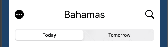
The preview should now show this (at the centre of the screen):
Main Card View
We will need to create 2 files for this step, the first one is a modal file that will hold our dummy data and the other one will be the MainCardView.
Create the first file, name it Weather.swift and add the following code in it:
import Foundation


struct Weather: Hashable, Identifiable {
    let id: Int
    let day: String
    let weatherIcon: String
    let currentTemp: String
    let minTemp: String
    let maxTemp: String
    let color: String

    static var sampleData: [Weather] {
        return [
            Weather(id: 1, day: "Monday", weatherIcon: "sun.max", currentTemp: "50", minTemp: "52", maxTemp: "69", color: "mainCard"),
            Weather(id: 2, day: "Tuesday", weatherIcon: "sun.dust", currentTemp: "33", minTemp: "52", maxTemp: "69", color: "tuesday"),
            Weather(id: 3, day: "Wednesday", weatherIcon: "cloud.sun.rain", currentTemp: "38", minTemp: "52", maxTemp: "59", color: "wednesday"),
            Weather(id: 4, day: "Thursday", weatherIcon: "cloud.sun.bolt", currentTemp: "33", minTemp: "52", maxTemp: "60", color: "thursday"),
            Weather(id: 5, day: "Friday", weatherIcon: "sun.haze", currentTemp: "40", minTemp: "52", maxTemp: "69", color: "friday"),
            Weather(id: 6, day: "Saturday", weatherIcon: "sun.dust", currentTemp: "50", minTemp: "52", maxTemp: "38", color: "saturday"),
            Weather(id: 7, day: "Sunday", weatherIcon: "sun.max", currentTemp: "50", minTemp: "52", maxTemp: "69", color: "sunday")
        ]
    }
}
Then create a SwiftUI View file, name it MainCardView.swift . Click resume if the preview doesn’t show up.
Replace this:
 var body: some View {
        Text("Hello World!”)
 }
with the following:
    @Binding var weather: Weather

    var body: some View{
        ZStack {

            Image("card-bg")
                .resizable().aspectRatio(contentMode: .fill)

            VStack(spacing: 10){
                Text("\(weather.currentTemp)°")
                    .foregroundColor(Color.white)
                    .fontWeight(Font.Weight.heavy)
                    .font(Font.system(size: 70))

                Image(systemName: weather.weatherIcon)
                .resizable()
                .foregroundColor(Color.white)
                .frame(width: 100, height: 100)
                .aspectRatio(contentMode: .fit)


                Text("\(weather.maxTemp)°")
                    .foregroundColor(Color.white)
                    .font(.title)
                    .padding(.vertical)
            }
        }
        .frame(minWidth: 0 , maxWidth: .infinity)
        .background(Color(weather.color))
    }
You will get the following error:
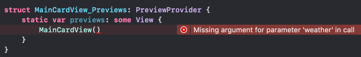
Replace the entire block with this:
struct MainCardView_Previews: PreviewProvider {
    static var previews: some View {
        MainCardView(weather: .constant(Weather.sampleData[0]))
    }
}
Explanation: The code is pretty self explanatory, but I will go over what I did in case there is confusion.
I added
@Bindingbefore the weather property and with that swiftUI automagically watch for changes to that property and update the part of the UI that uses.@Bindingworks the same way as@Statedoes but instead of being local, it’s global.I make the image resizable and then set its content mode to fill to stretch it out
stack the 2 text views and the weatherIcon vertically.
I set the frame’s minWidth and maxWidth to 0 and .infinity to make the width match the screen width on all device sizes.
Tip: Use
.frame(minWidth: 0 , maxWidth: .infinity)or.frame(minHeight: 0 , maxHeight: .infinity)to fill the parent’s width or height no matter the screen size (the view you set the frame to will be responsive).
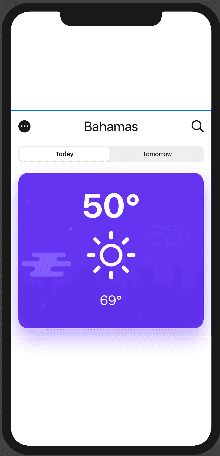
The preview should now show this:

The next thing to do is to add our newly created view to the WeatherApp View.
Add this below the selected property:
@State private var weather = Weather(id: 1, day: "Monday", weatherIcon: "sun.max", currentTemp: "50", minTemp:"52", maxTemp: "69", color: "mainCard")
And this below the Picker call:
  MainCardView(weather: $weather)
                .cornerRadius(CGFloat(20))
                .padding()
                .shadow(color: Color(self.weather.color)
                .opacity(0.4), radius: 20, x: 0, y: 20)
$ (dollar sign) before weather means that the state of this local weather property is bound to the property located in MainCardView, whenever one of Them changes, the other will be notified and change accordingly. Simply put, they are in sync.
The rest of the code is self explanatory.
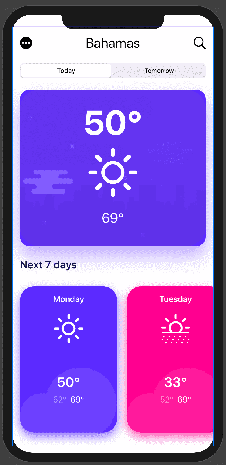
After making those changes, click resume and the preview should show this:
Horizontal scrolling list of cards: Next 7 days
Let’s first create the title. Add the following code below MainCardView:
Text("Next 7 days").foregroundColor(Color("text"))
         .font(.system(size: 22))
         .fontWeight(.bold)
         .frame(minWidth:0, maxWidth: .infinity, alignment: .leading)
         .padding(.horizontal)
The above code just create a text, align it to the left and apply an horizontal padding.
The next step is to create a single card that will be reused to create the horizontally scrolling list.
Create a new SwiftUI file, the same way you did for the MainCardView, name it SmallCardfor lack of a better word.
Replace the content of that file with the Following:
import SwiftUI

struct SmallCard: View {
    var weather: Weather = Weather(id: 1, day: "Monday", weatherIcon:  "sun.max", currentTemp:  "40", minTemp: "25", maxTemp: "69", color: "mainCard")

       var body: some View{

           VStack(spacing: 20) {
               // Day text
               Text(self.weather.day).fontWeight(.bold)
                   .foregroundColor(Color.white)

               // Weather icon
               Image(systemName: self.weather.weatherIcon)
                   .resizable()
                   .foregroundColor(Color.white)
                   .frame(width: 60, height: 60)


               // Temp texts
               ZStack {
                   Image("cloud")
                       .resizable()
                       .scaledToFill()
                       .offset(CGSize(width: 0, height: 30))

                   VStack(spacing: 8) {
                       Text("\(self.weather.currentTemp)°").font(.title).foregroundColor(Color.white).fontWeight(.bold)
                       HStack {
                           Text("\(self.weather.minTemp)°").foregroundColor(Color("light-text"))
                           Text("\(self.weather.maxTemp)°").foregroundColor(Color.white)
                       }
                   }
               }
           }
           .frame(width: 200, height: 300)
           .background(Color(self.weather.color))
           .cornerRadius(30)
           .shadow(color: Color(weather.color).opacity(0.7), radius: 10, x: 0, y: 8)
       }
}

struct SmallCard_Previews: PreviewProvider {
    static var previews: some View {
        SmallCard( )
    }
}
Explanation:
The code is very familiar with what I have previously. The only new thing is the ZStack container. A ZStack is a view that overlays its child views on top of each other. (“Z” represents the Z-axis which is depth-based in a 3D space)
We push the cloud icon down by 30 by setting its height offset to 30.
You should take your time reading the code line by line as it’s pretty self-explanatory.
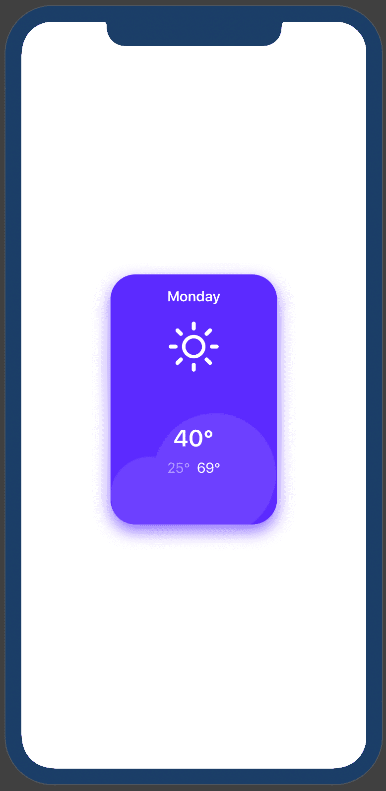
The previews should now display this:
Let’s now create the horizontally scrolling list. Go back the WeatherApp file.
Add the following code below the next 7 days text:
  ScrollView(.horizontal, showsIndicators: false) {
                HStack(spacing: 20) {
                    ForEach(Weather.sampleData, id: \.id) { weather                             in
                        SmallCard(weather: weather)
                    }
                }.frame( height: 380)
                    .padding(.horizontal)
            }.frame( height: 350, alignment: .top)
Explanation:
In the above code, I put an horizontal stacked list of SmallCard (that we’ve just created earlier) inside a ScrollView to make it scrollable.
Note: This is not the most efficient way to create a list of items, use it when you know the number of items is small and limited. Use List for a big list of items
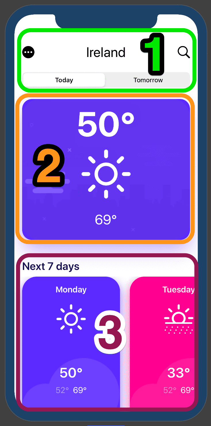
After that the preview should show this:
Details View
When one of the small cards is clicked, we want to show the detail view which will animate from the bottom.
Go ahead and create a new swiftUI file named DetailView.swift
Replace the content of the file with this:
import SwiftUI

struct DetailView: View {

    @Binding var weather: Weather

    var body: some View {
        GeometryReader { gr in
            VStack(spacing: 20) {

                // Day text
                Text(self.weather.day).fontWeight(.bold)
                    .font(.system(size: 60))
                    .frame(height: gr.size.height * 1/10)
                    .minimumScaleFactor(0.5)
                    .foregroundColor(Color.white)

                // Weather image
                Image(systemName: self.weather.weatherIcon)
                    .resizable()
                    .foregroundColor(Color.white)
                    .frame(width: gr.size.height * 3 / 10, height: gr.size.height * 3 / 10)

                // Degrees texts
                VStack {
                    VStack(spacing: 20) {
                        Text("\(self.weather.currentTemp)°")
                            .font(.system(size: 50))
                            .foregroundColor(Color.white)
                            .fontWeight(.bold)
                            .frame(height: gr.size.height * 0.7/10)
                            .minimumScaleFactor(0.5)

                        HStack(spacing: 40) {
                            Text("\(self.weather.minTemp)°")
                                .foregroundColor(Color("light-text"))
                                .font(.title)
                                .minimumScaleFactor(0.5)

                            Text("\(self.weather.maxTemp)°")
                                .foregroundColor(Color.white)
                                .font(.title)
                                .minimumScaleFactor(0.5)
                        }
                    }
                }
                }.frame(minWidth: 0, maxWidth: .infinity, minHeight: gr.size.height, alignment: .bottom)
            .background(Color(self.weather.color))
        }
    }
}

struct DetailView_Previews: PreviewProvider {
    static var previews: some View {
        DetailView(weather: .constant(Weather(id: 1, day: "Monday", weatherIcon:  "sun.max", currentTemp:  "40", minTemp: "25", maxTemp: "69", color: "mainCard")))
    }
}
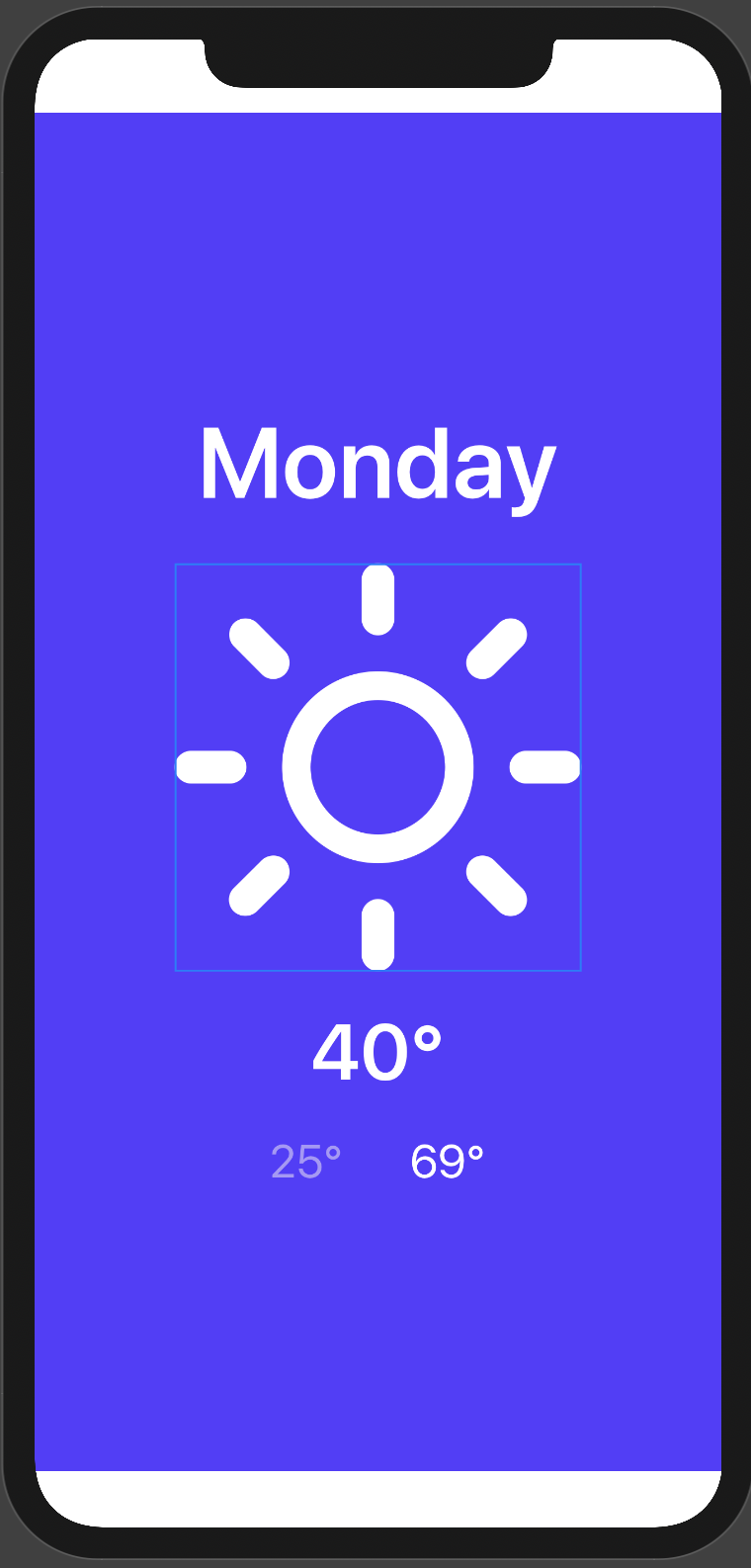
The code is pretty similar with what we did earlier except I surrounded the outer VStack with GeometryReader.
Note: GeometryReader is a container view that defines its content as a function of its own size and coordinate space. What that means is thatGeometryReader gives us the size and position that we can use to dynamically position and resize child views
The preview should show this:
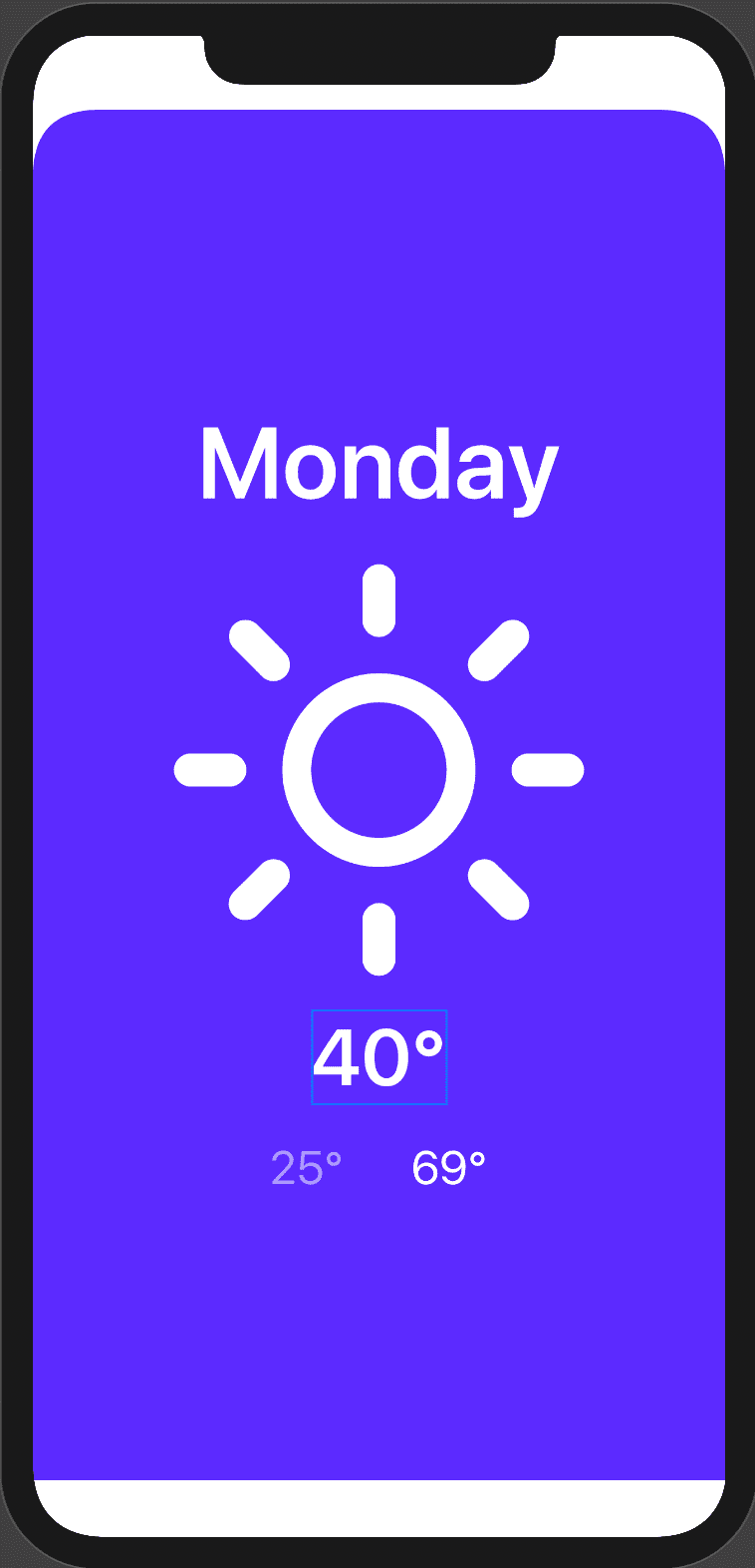
The next step is to make the view rounded only at the top left and right. To do that we will create a custom shape that we will use to clip the view. Let’s go.
Add this below DetailsView and outside its block:
struct CustomShape: Shape {
    func path(in rect: CGRect) -> Path {
        let cornerRadius:CGFloat = 40
        var path = Path()

        path.move(to:  CGPoint(x: 0, y: cornerRadius))
        path.addQuadCurve(to: CGPoint(x: cornerRadius, y: 0), control: CGPoint.zero)
        path.addLine(to: CGPoint(x: rect.width - cornerRadius, y: 0))
        path.addQuadCurve(to: CGPoint(x: rect.width, y: cornerRadius), control: CGPoint(x: rect.width , y: 0))
        path.addLine(to: CGPoint(x: rect.width, y: rect.height))
        path.addLine(to: CGPoint(x: 0, y: rect.height))
        path.closeSubpath()

        return path
    }
}
And add this modifier on the parent VStack in DetailsView after .background(Color(self.weather.color)):
.clipShape(CustomShape(), style: FillStyle.init(eoFill: true, antialiased: true))
You should see this on the preview:
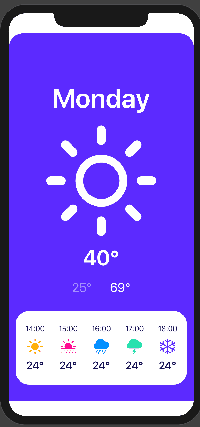
Next, we will create the next 5 hours view:
Add this code below the CustomShape block:
struct HourView: View {
    var hour = "14:00"
    var icon = "sun.max.fill"
    var color = "wednesday"

    var body: some View {
        GeometryReader { gr in
            VStack{
                Text(self.hour).foregroundColor(Color("text"))
                Image(systemName: self.icon)
                    .resizable()
                    .foregroundColor(Color(self.color))
                    .frame(width: gr.size.height * 1/3, height: gr.size.height * 1/3)

                Text("24°")
                    .font(.system(size: 24))
                    .foregroundColor(Color("text"))
                    .fontWeight(.semibold)
            }
        }.padding(.vertical, 30)
    }
}
And create the horizontal stacked view like this:
Put the following code below, VStack in DetailView’s body.
     // Hourly views
                HStack (spacing: 20){
                    HourView()
                    HourView(hour: "15:00", icon: "sun.dust.fill", color: "tuesday")
                    HourView(hour: "16:00",icon: "cloud.rain.fill", color: "thursday")
                    HourView(hour: "17:00",icon: "cloud.bolt.fill", color: "sunday")
                    HourView(hour: "18:00",icon: "snow", color: "mainCard")
                }.frame(minWidth: 0, maxWidth: .infinity, minHeight: gr.size.height * 2 / 10)
                .padding(.horizontal)
                .background(Color.white)
                .cornerRadius(30)
                .padding()
As you can see, I’m reusing the HourView to create the hourly forecast.
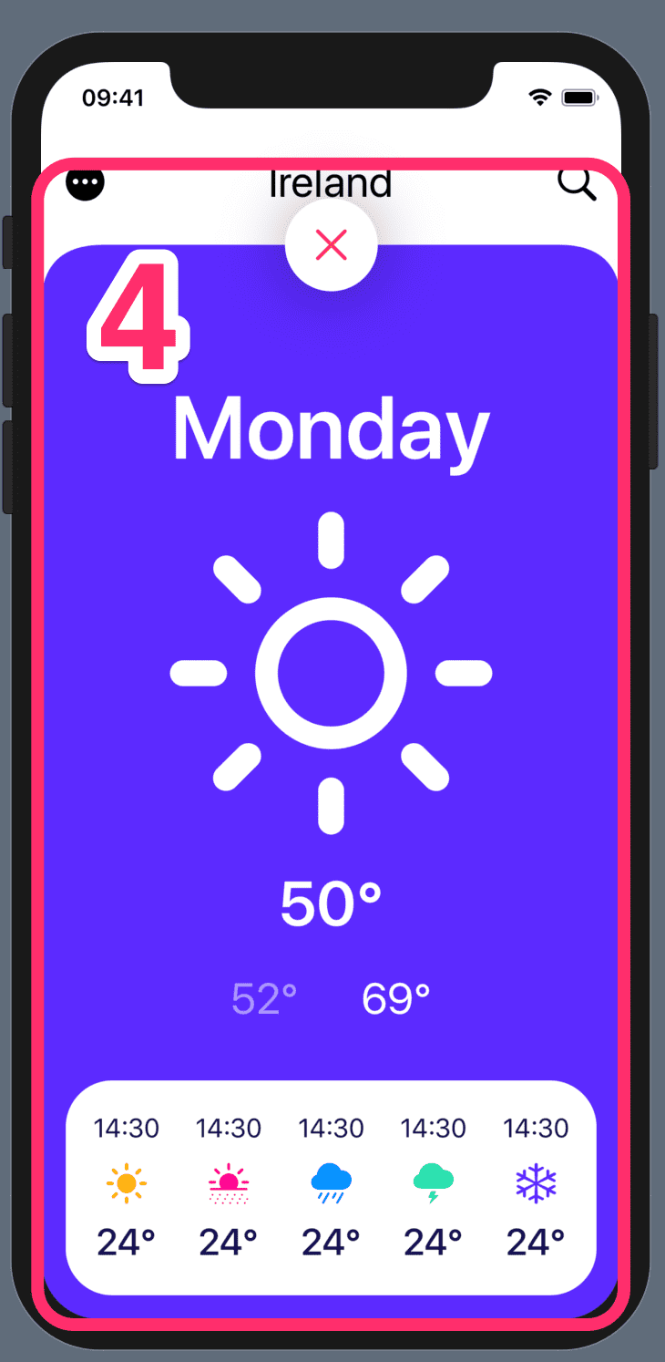
The preview should show something like:
Your complete DetailView.swift file should look like this:
import SwiftUI

struct DetailView: View {

     @Binding var weather: Weather

    var body: some View {
        GeometryReader { gr in
            VStack(spacing: 20) {

                // Day text
                Text(self.weather.day).fontWeight(.bold)
                    .font(.system(size: 60))
                    .frame(height: gr.size.height * 1/10)
                    .minimumScaleFactor(0.5)
                    .foregroundColor(Color.white)

                // Weather image
                Image(systemName: self.weather.weatherIcon)
                    .resizable()
                    .foregroundColor(Color.white)
                    .frame(width: gr.size.height * 3 / 10, height: gr.size.height * 3 / 10)

                // Degrees texts
                VStack {
                    VStack(spacing: 20) {
                        Text("\(self.weather.currentTemp)°")
                            .font(.system(size: 50))
                            .foregroundColor(Color.white)
                            .fontWeight(.bold)
                            .frame(height: gr.size.height * 0.7/10)
                            .minimumScaleFactor(0.5)

                        HStack(spacing: 40) {
                            Text("\(self.weather.minTemp)°")
                                .foregroundColor(Color("light-text"))
                                .font(.title)
                                .minimumScaleFactor(0.5)

                            Text("\(self.weather.maxTemp)°")
                                .foregroundColor(Color.white)
                                .font(.title)
                                .minimumScaleFactor(0.5)
                        }
                    }
                }

                // Hourly views
                HStack (spacing: 20){
                    HourView()
                    HourView(hour: "15:00", icon: "sun.dust.fill", color: "tuesday")
                    HourView(hour: "16:00",icon: "cloud.rain.fill", color: "thursday")
                    HourView(hour: "17:00",icon: "cloud.bolt.fill", color: "sunday")
                    HourView(hour: "18:00",icon: "snow", color: "mainCard")
                }.frame(minWidth: 0, maxWidth: .infinity, minHeight: gr.size.height * 2 / 10)
                .padding(.horizontal)
                .background(Color.white)
                .cornerRadius(30)
                .padding()

            }.frame(minWidth: 0, maxWidth: .infinity, minHeight: gr.size.height, alignment: .bottom)
                    .background(Color(self.weather.color))
                    .clipShape(CustomShape(), style: FillStyle.init(eoFill: true, antialiased: true))


        }
    }
}

struct CustomShape: Shape {
    func path(in rect: CGRect) -> Path {
        let cornerRadius:CGFloat = 40
        var path = Path()

        path.move(to:  CGPoint(x: 0, y: cornerRadius))
        path.addQuadCurve(to: CGPoint(x: cornerRadius, y: 0), control: CGPoint.zero)
        path.addLine(to: CGPoint(x: rect.width - cornerRadius, y: 0))
        path.addQuadCurve(to: CGPoint(x: rect.width, y: cornerRadius), control: CGPoint(x: rect.width , y: 0))
        path.addLine(to: CGPoint(x: rect.width, y: rect.height))
        path.addLine(to: CGPoint(x: 0, y: rect.height))
        path.closeSubpath()

        return path
    }
}

struct HourView: View {
    var hour = "14:00"
    var icon = "sun.max.fill"
    var color = "wednesday"

    var body: some View {
        GeometryReader { gr in
            VStack{
                Text(self.hour).foregroundColor(Color("text"))
                Image(systemName: self.icon)
                    .resizable()
                    .foregroundColor(Color(self.color))
                    .frame(width: gr.size.height * 1/3, height: gr.size.height * 1/3)

                Text("24°")
                    .font(.system(size: 24))
                    .foregroundColor(Color("text"))
                    .fontWeight(.semibold)
            }
        }.padding(.vertical, 30)
    }
}


struct DetailView_Previews: PreviewProvider {
    static var previews: some View {
        DetailView(weather: .constant(Weather(id: 1, day: "Monday", weatherIcon:  "sun.max", currentTemp:  "40", minTemp: "25", maxTemp: "69", color: "mainCard")))
    }
}
Let us now integrate our DetailView into the WeatherApp:
We want to add a tapGesture on each SmallCardView so that when we click on any of them, we show a correspondent details.
Find the SmallCard call and replace it with the following:
SmallCard(weather: weather).onTapGesture {
                            self.showDetails.toggle()
                            self.weather = weather

                    }
and add this on top of the file below weather
@State private var showDetails = false
Everytime one of the SmallCard is clicked, we want to toggle the showDetails’ value.
Add this below showDetails:
private var detailSize = CGSize(width: 0, height: UIScreen.main.bounds.height)
And surround the MainCardView, the next 7 days Text and ScrollView with a ScrollView(.vertical, sh owsIndicators: false) which makes it scrollable vertically.
Now, put the newly added ScrollView into a ZStack container and add the following code below the ScrollView inside the ZStack block:
 DetailView(weather: $sampleData[selected])
                .offset( self.showDetails ? CGSize.zero : detailSize)
And this below detailSize property at the top:
@State private var sampleData = Weather.sampleData
As you may have noticed already, there is a gap at the bottom . To fix that add this modifier to the outer VStack container.
.edgesIgnoringSafeArea(.bottom)
To make the DetailView animate beautifully surround these 2 calls inside onTapGesture with withAnimation(.spring()) like this:
  withAnimation(.spring()) {
                                        self.showDetails.toggle()
                                        self.weather = weather
                                    }
Close Button
In DetailView.swift, surround the outer VStack with a ZStack and below the outer VStack add the following:
     // Close icon
                HStack {
                    Image(systemName: "xmark")
                        .resizable()
                        .foregroundColor(Color.red)
                        .frame(width: 20, height: 20)

                }.padding(20
                ).background(Color.white)
                    .cornerRadius(100)
                    .offset(x: 0, y: -gr.size.height / 2)
                    .shadow(radius: 20)
The important bit is this .offset(x: 0, y: -gr.size.height / 2). When you add views in a VStack container, they will be stacked on top of each other on the centre of the container (In this case, the ZStack container) . So, to position the at the top , with we move it up by 1/2 the ZStack height.
Let’s now add onTapGesture to allow dismissal of the DetailView.
First, add this @Binding var showDetails: Bool
to the top above body and add this showDetails: .constant(false) parameter in DetailView’s constructor inside DetailView_Previews ‘ block.
Last, add this modifier on Close icon HStatck after shadow:
 .onTapGesture {
                        withAnimation(.spring()) {
                            self.showDetails.toggle()
                        }
                }
You ‘ll get an error in WeatherApp. Just add this parameter ,showDetails: self.$showDetails to the constructor.
The last that you can do to make the transition look good is to show / hide a background blur based on the showDetails value.
Add this below detailSize to the top:
private var blurRadius = CGFloat(5.0)
Then, add this .blur(radius: showDetails ? blurRadius : 0) to NavBarView, Picker and the ScrollView.
Drag dismissal
Wouldn’t be nice if the user had a second and more intuitive option to dismiss the DetailView by dragging it down? Well, thanks to SwiftUI, implementing this behaviour is very simple. Let me show you how.
First, add this line to the top of the WeatherApp struct:
private var yOffset:CGFloat = 0.0
Then add this line in SmallCard tapGesture closure, below self.weather = weather:
self.yOffset = 0.0
Last, replace the offset modifier on DetailView with the following:
.offset(x: 0, y: showDetails ? yOffset : self.screenHeight)
.gesture(
        DragGesture().onChanged({ value in
            self.yOffset = value.translation.height
        }).onEnded({ value in
            withAnimation(.spring()) {
                if self.yOffset > self.screenHeight / 3 {
                    self.yOffset = self.screenHeight
                    self.showDetails = false
                } else {
                    self.yOffset = 0.0

                }
            }
        })
    )
Explanation
- The yOffset value will be toggled between 0.0 and the full screen height.
- I then set the y offset of the DetailView to 0.0 if showDetails is true otherwise remove it by setting the y offset to full height screen
- We set yOffset with the vertical translation because we only want to move the view vertically.
- We put the dismissal logic in a withAnimation block to animate the view smoothly.
The rest of the code is ease to understand. Setting the yOffset to full screen height means the view will be dismissed whereas setting it to 0.0 makes it visible.